Causality and Simpson's Paradox
Raw observational data, no matter how much of it is available, is not enough to be actionable, where actionable means that we can ask causal questions and infer the answers. Being able to answer causal questions from the data means that we are able to correctly interpret the data and make better decisions.
Judea Pearl one of the pioneers and advocates of causal inference in data science writes in the “Book of Why”:
“… causal questions can never be answered from data alone. They requires us to formulate a model of the process that generates the data, or at least some aspects of that process.”
In the book Judea describes three rungs in the ladder of causality:
- Seeing - Observing and describing the data in terms of join distributions, correlations, conditional probability, etc.
- Doing - Intervening on the data to answer what will happen if we make an action.
- Imagining - Counterfactual thinking, what would have happened if a different course of action was taken, given we know what has happened.
Most current data science is done in the first rung. Therefore, to go at least from the first to the second rung, assumptions need to be made and a model of how the data was generated needs to be created. In fact, the same data (having the same join distribution) can have completely different interpretation under different causal models. In some cases, causal models cannot even be distinguished just from the data, and require further assumptions.
A nice demonstrations of the points above is with Simpson’s paradox, which is a generic name to situations where trends in sub-populations are reversed in the overall populations. Using the example from Dr. Paul Hunermund’s Causal data science course, the data consists of salaries of 100 men and 100 women in management and non-management roles summarized in the table below:
| Female | Male | |
|---|---|---|
| Non-Management | $3,163.30 (87) | $3,015.18 (59) |
| Management | $5,592.44 (13) | $5,319.82 (41) |
| Average | $3,479.09 | $3,960.08 |
We see from the table that both within management roles and within non-management roles, females have a higher salary than males, however overall on average females have a lower salary than males (lower by \(\sim \$481\)). The apparent paradox is easily resolved mathematically by the fact that if $\frac{a}{b} > \frac{c}{d}$ and $\frac{e}{f} > \frac{g}{h}$ it doesn’t follow that $\frac{a+e}{b+f} > \frac{c+g}{d+h}$. However beyond the algebra there is a real and unequivocal question, are females underpaid compared to men or not?
To answer this question, we need to have a causal model behind the data, which entails assuming something beyond the raw data.
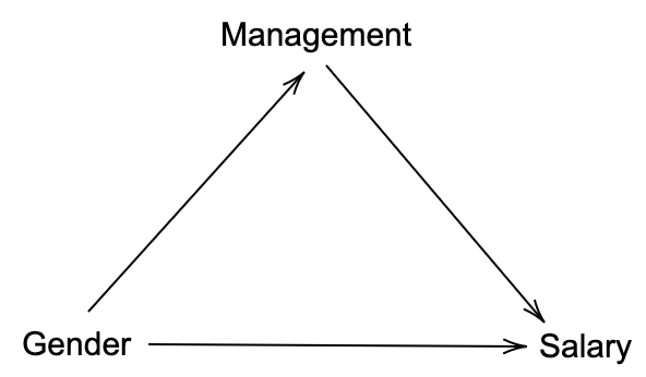
The arrows indicate a causal relation represented by a functional assignment involving the parent random variables and external noise which is not represented in the diagram. For example $Salary = f(Gender, Management, External)$. From the arrows, we see that the diagram assumes that gender (G) affects both management (M) and salary (S). Reasonably, management doesn’t affects one’s gender, but management does affect the salary. To answer the question we are interested in the influence of gender on salary in the common notation:
\[p(S|do(G=F)) - p(S|do(G=M))\]Here, the $do$ notation means, changing the corresponding random variable for the entire population i.e. intervening.Diagrammatically, intervening implies removing any arrows pointing to that variable as we are setting its value independent of any external influence. The question then is how can we obtain the result of the intervention having only observational data. In this first diagram, there are no such arrows, and therefore intervening will not change anything in the diagram and in the probability distribution it generates. The end result (which can be reduced from the more general case) is therefore:
\[p(S|do(G=F)) - p(S|do(G=M)) = p(S|G=F) - p(S|G=M)\]which corresponds to:
\[\$3,479.09 - \$3,960.08 = -\$481\]i.e. the pay gap is indeed in favor of males.
The interesting part comes when we consider the same raw data, however change gender with lifestyle as in the below table:
| Healthy Lifestyle | Unhealthy Lifestyle | |
|---|---|---|
| Non-Management | $3,163.30 (87) | $3,015.18 (59) |
| Management | $5,592.44 (13) | $5,319.82 (41) |
| Average | $3,479.09 | $3,960.08 |
The numbers remained the same (and so does Simpson’s paradox), however the causal model diagram changed. In this new model the causal arrow goes between management to lifestyle. This is known as a fork structure in which management is a confounder of lifestyle and salary.
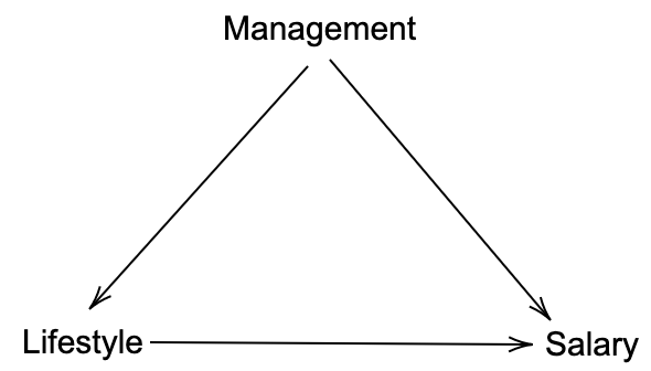
The question we want to answer remains the same apart from changing gender with lifestyle (L). Given the data, does healthy lifestyle lead to higher salary? In this case, due to the different causal model, simply conditioning on lifestyle (i.e. taking average salary by lifestyle) will give the wrong answer (comparing with the gender pay gap) that unhealthy lifestyle result in higher salary.
The causal effect we want to calculate is:
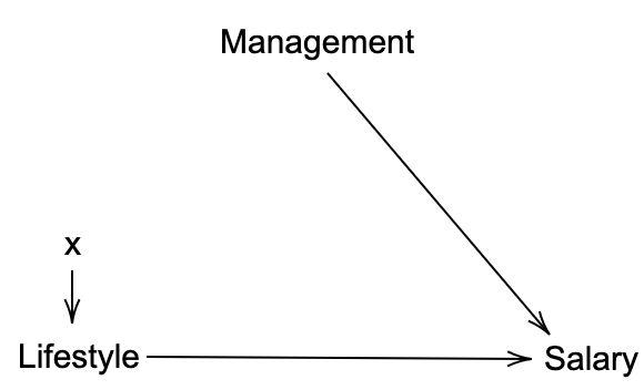
\[p(S|do(L=Healthy)) - p(S|do(L=Unhealthy)).\]In this case as the lifestyle random variable has a parent (management), setting its value will remove the arrow resulting in the new diagram below and a new joint distribution $p_m(L, M, S)$.
The surprising fact is that we can answer the intervention question in terms of the observations. Following Judea Pearl’s Causal Inference in Statistics: A primer, the trick is to marginalize over the parents:
\[p(S=s|do(L=x)) = p_m(S=s|L=x) = \sum_z p_m(S=s|L=x, M=z)p_m(M=z|L=x).\]Since there is no arrow between management (it is said that $L$ and $M$ are d-separated because there is no-unblocked path between them) and lifestyle we have: $p_m(M=z|L=x) = p_m(M=z) = p(M=z)$, where the last equality comes from the fact that we didn’t intervene on $M$. Second, since the intervention doesn’t change the functional relationship between $S$ and $M, L$ we also have: $p_m(S=s|L=x, M=z) = p(S=s|L=x, M=z)$.
Finally we can write:
\[p(S=s|do(L=x)) = \sum_z p(S=s|L=x, M=z)p(M=z).\]More generally, this is a special case of the Causal Effect Rule, which says that the causal effect of $X$ on $Y$ is given by:
\[P(Y=y|do(X=x)) = \sum_z P(Y=y|X=x, PA=z)P(PA=z),\]where $PA$ are the set of parents of $X$ in the causal graph. In other words we are conditioning over $X$’s parents.
Back to the example, we calculate the expected value of the salary under the probability distributions resulting from the two interventions (a similar expression obtained by replacing $H$ with $U$):
\[p(S=s|do(L=H)) = p(S=s|L=H, M=M)p(M=M)+ p(S=s|L=H, M={\rm not}\ M)p(M={\rm not}\ M)\]To cast this into expectations we use:
\[E(S=s|do(L=H)) = \sum_s s \cdot p(S=s|do(L=H)) = \\ \sum_s s \sum_z p(S=s|L=H, M=z)p(M=z) = \sum_z p(M=z)\sum_s s\cdot p(S=s|L=H, M=z) = \\ \sum_z p(M=z) E(S=s|L=H, M=z).\]The expectation in the above expression is what we have in the table. Using the values in the table we get for for the average causal effect (ACE):
\[ACE(L=H) = 5,592.44\cdot\frac{13+41}{200} + 3,163.30\cdot\frac{87+59}{200} = 3,819.17,\]and
\[ACE(L=U) = 5,319.82\cdot\frac{13+41}{200} + 3,015.18\cdot\frac{87+59}{200} = \$3,637.43.\]The difference is:
\[ACE(L=H) - ACE(L=U)=\$181.74,\]which is positive in favour of the healthy lifestyle.
In conclusion, the same raw observational data with different causal models leads to opposite actionable results.